
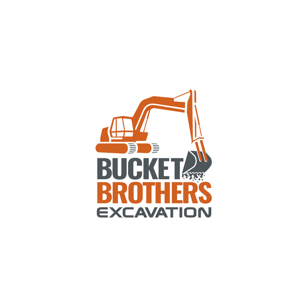


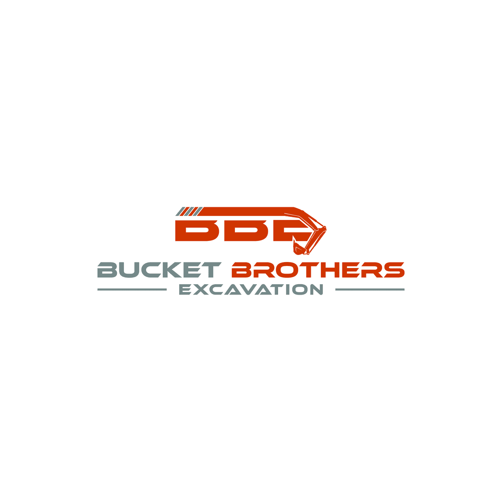
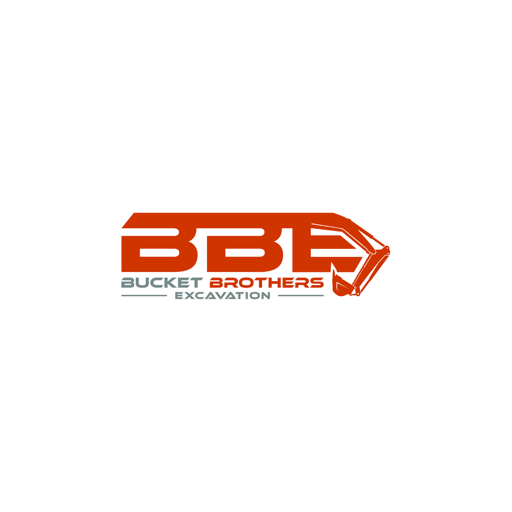
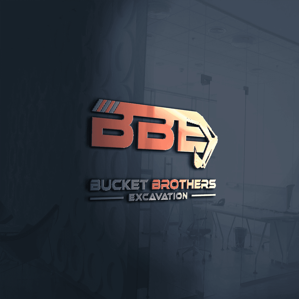
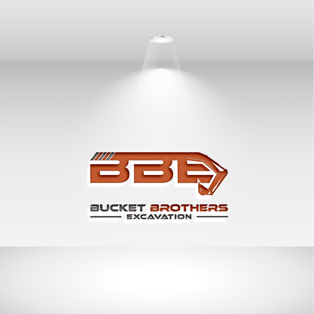


Bucket Brothers Excavation is a budding excavation company based in Philadelphia, USA. Founded by two friends, the company specializes in providing excavation services with a focus on efficiency, precision, and reliability. The name "Bucket Brothers" reflects both the partnership between the founders and the essential tool of their trade—the excavator bucket. The company values teamwork, innovation, and a commitment to delivering high-quality services to its clients.
Design Preferences:
-
Style: The logo should be bold and dynamic, reflecting the energy and strength of the excavation industry. It should convey a sense of reliability and professionalism while also showcasing the partnership aspect of the business.
-
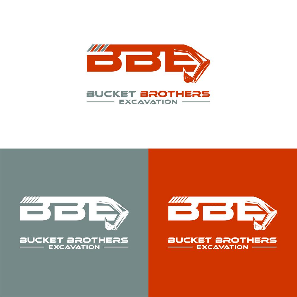
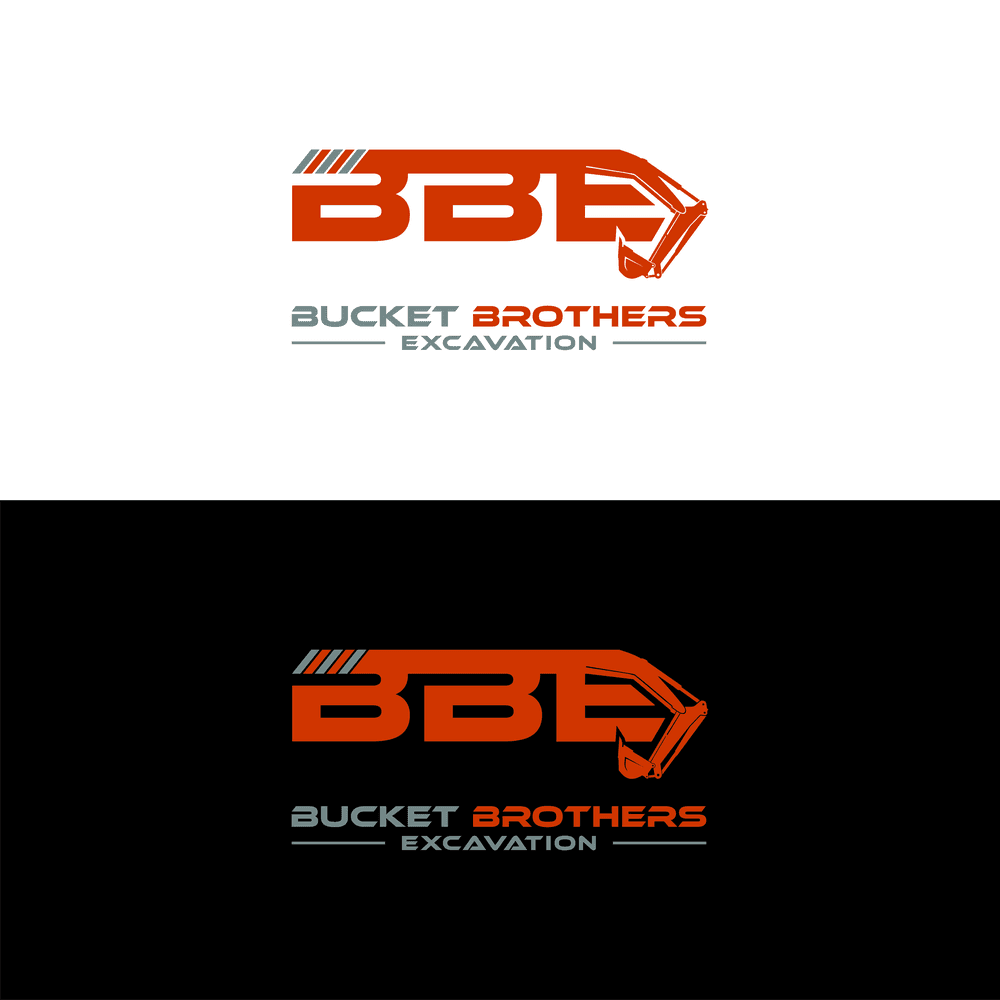
Colors: Utilize dark grey and a deep burnt orange as the primary colors. The logo should be limited to these two colors to ensure it can be easily reproduced on garments as well as documents.
-
Typography: Use strong, bold sans-serif fonts that are easily readable and convey a sense of strength and stability. The typography should complement the iconography and maintain a professional appearance.
-
Iconography: The logo should prominently feature an excavator bucket, possibly along with the boom (arm), to clearly represent the company's core activity. The bucket should be depicted in a dynamic manner, perhaps in motion or at an angle, to convey action and capability.
-
Usability: The logo should be versatile and scalable, ensuring it looks great on various mediums such as business cards, signage, and digital platforms. It should be easily recognizable and maintain its impact in both color and monochrome formats.
-
Emotion: The logo should evoke feelings of trust, strength, and partnership, highlighting the collaborative spirit of the "brothers" in the company's name.